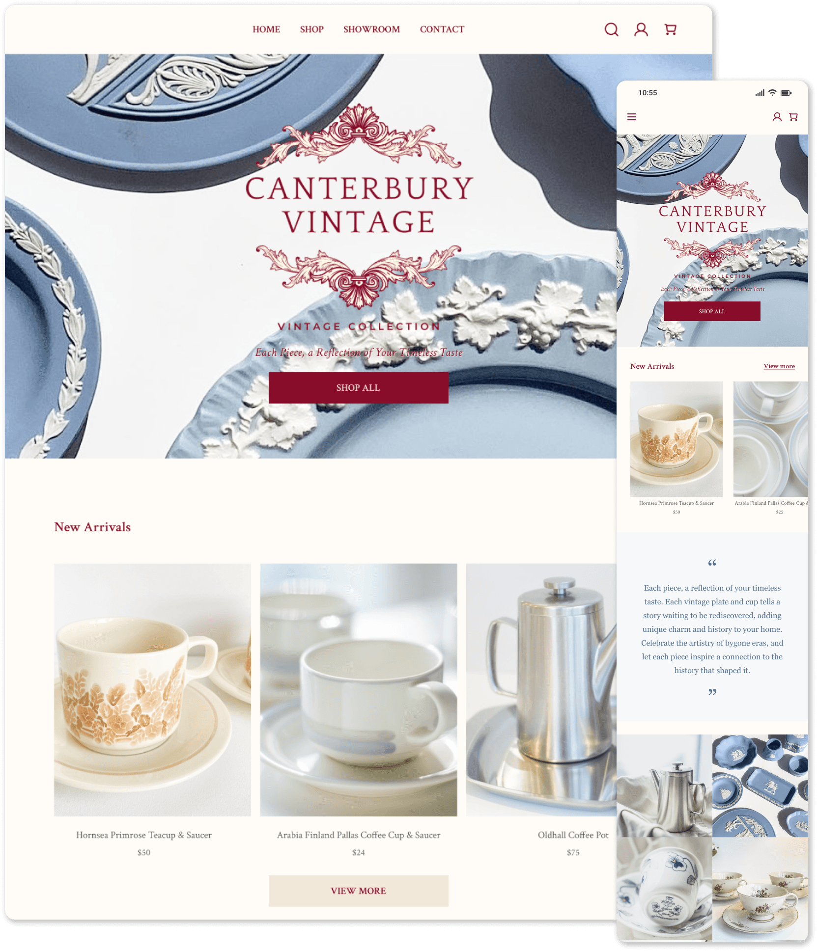


Responsive Website - Client Project
Developed a user-friendly, responsive e-commerce website for seamless navigation and engagement
Responsive Website - Client Project
Developed a user-friendly, responsive e-commerce website for seamless navigation and engagement
Responsive Website - Client Project
Developed a user-friendly, responsive e-commerce website for seamless navigation and engagement
| Project Overview
| Project Overview
| Project Overview
Background
Background
Background
Canterbury Vintage specializes in high-quality vintage home decor from the UK, offering unique collections from brands like Royal Copenhagen and Wedgwood. The business prides itself on meticulously curated inventory and engages its audience primarily through Instagram.
The Founder/Client seeks to establish a brand identity and develop a responsive e-commerce website to expand the business's online presence, providing an intuitive platform for browsing and purchasing vintage items.
PROJECT
PROJECT
PROJECT
Responsive Web Design
(Client Project)
Responsive Web Design
(Client Project)
Responsive Web Design
(Client Project)
MY ROLE
MY ROLE
MY ROLE
Researcher, UX Designer, UI Designer
Researcher, UX Designer, UI Designer
Researcher, UX Designer, UI Designer
DEVICE
DEVICE
DEVICE
Desktop, Mobile
Desktop, Mobile
Desktop, Mobile
TOOLS
TOOLS
TOOLS
Figma, Zoom, Canva
Figma, Zoom, Canva
Figma, Zoom, Canva
DURATION
DURATION
DURATION
65 Hours time limit
65 Hours time limit
65 Hours time limit
CONSTRAINTS
CONSTRAINTS
CONSTRAINTS
Maintain the branding style that the founder (client) finds comfortable and satisfactory
Maintain the branding style that the founder (client) finds comfortable and satisfactory
Maintain the branding style that the founder (client) finds comfortable and satisfactory
EMPATHIZE
EMPATHIZE
EMPATHIZE
| Competitor Analysis
| Competitor Analysis
| Competitor Analysis
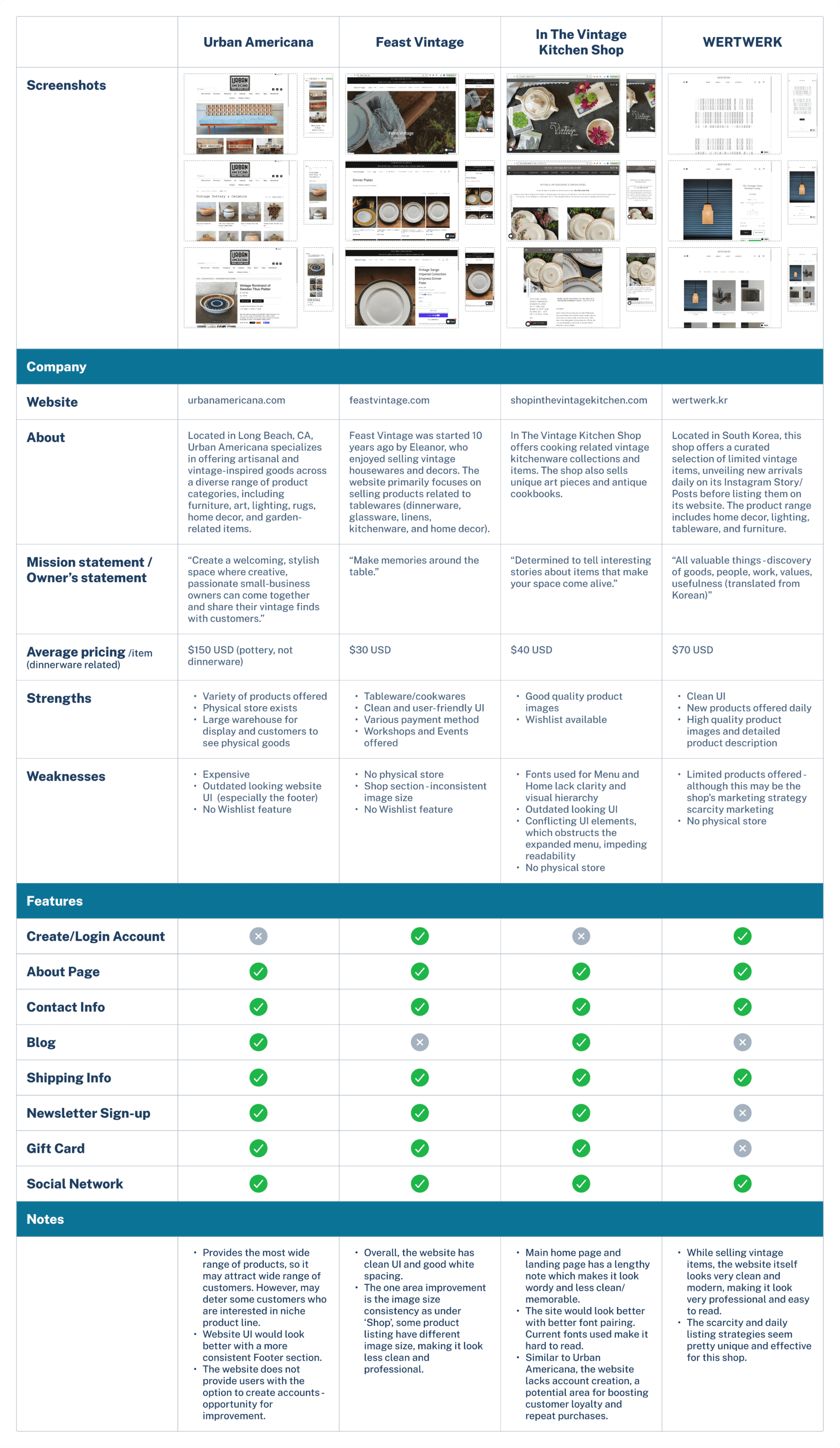
I conducted a competitor analysis comparing three direct competitors (Feast Vintage, In The Vintage Kitchen Shop, WertWerk) and one indirect competitor (Urban Americana). I focused on the homepage, shop page, and item description page, while also briefly reviewing other pages to compare features. WerkWerk's UI and layout closely matched my client's vision for her website, featuring a clean, elegant, and consistent design with ample white space and a streamlined shop page displaying only products and prices. The other competitors offered a wide range of vintage products but lacked consistency in fonts and image sizes, or appeared too wordy and cluttered, making them look less professional.
I conducted a competitor analysis comparing three direct competitors (Feast Vintage, In The Vintage Kitchen Shop, WertWerk) and one indirect competitor (Urban Americana). I focused on the homepage, shop page, and item description page, while also briefly reviewing other pages to compare features. WerkWerk's UI and layout closely matched my client's vision for her website, featuring a clean, elegant, and consistent design with ample white space and a streamlined shop page displaying only products and prices. The other competitors offered a wide range of vintage products but lacked consistency in fonts and image sizes, or appeared too wordy and cluttered, making them look less professional.
I conducted a competitor analysis comparing three direct competitors (Feast Vintage, In The Vintage Kitchen Shop, WertWerk) and one indirect competitor (Urban Americana). I focused on the homepage, shop page, and item description page, while also briefly reviewing other pages to compare features. WerkWerk's UI and layout closely matched my client's vision for her website, featuring a clean, elegant, and consistent design with ample white space and a streamlined shop page displaying only products and prices. The other competitors offered a wide range of vintage products but lacked consistency in fonts and image sizes, or appeared too wordy and cluttered, making them look less professional.


| User Interviews
| User Interviews
| User Interviews
After understanding the strengths and weaknesses of competitors, I conducted user interviews to gain insights into users' experiences with purchasing home decor products online, especially vintage items. I focused on identifying their pain points, desired changes, and what features would be most useful to them.
After understanding the strengths and weaknesses of competitors, I conducted user interviews to gain insights into users' experiences with purchasing home decor products online, especially vintage items. I focused on identifying their pain points, desired changes, and what features would be most useful to them.
After understanding the strengths and weaknesses of competitors, I conducted user interviews to gain insights into users' experiences with purchasing home decor products online, especially vintage items. I focused on identifying their pain points, desired changes, and what features would be most useful to them.


| Research Synthesis
| Research Synthesis
| Research Synthesis
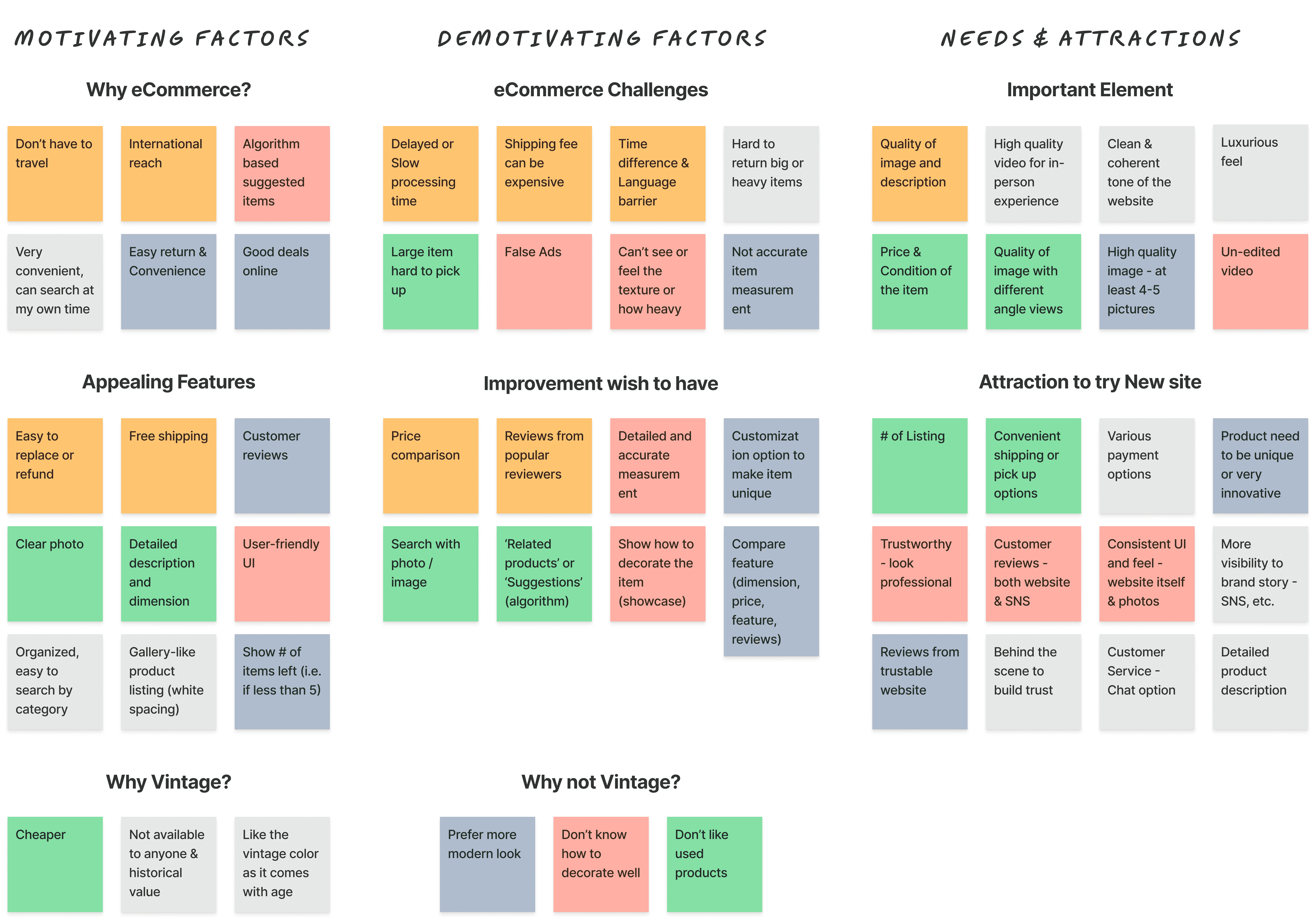
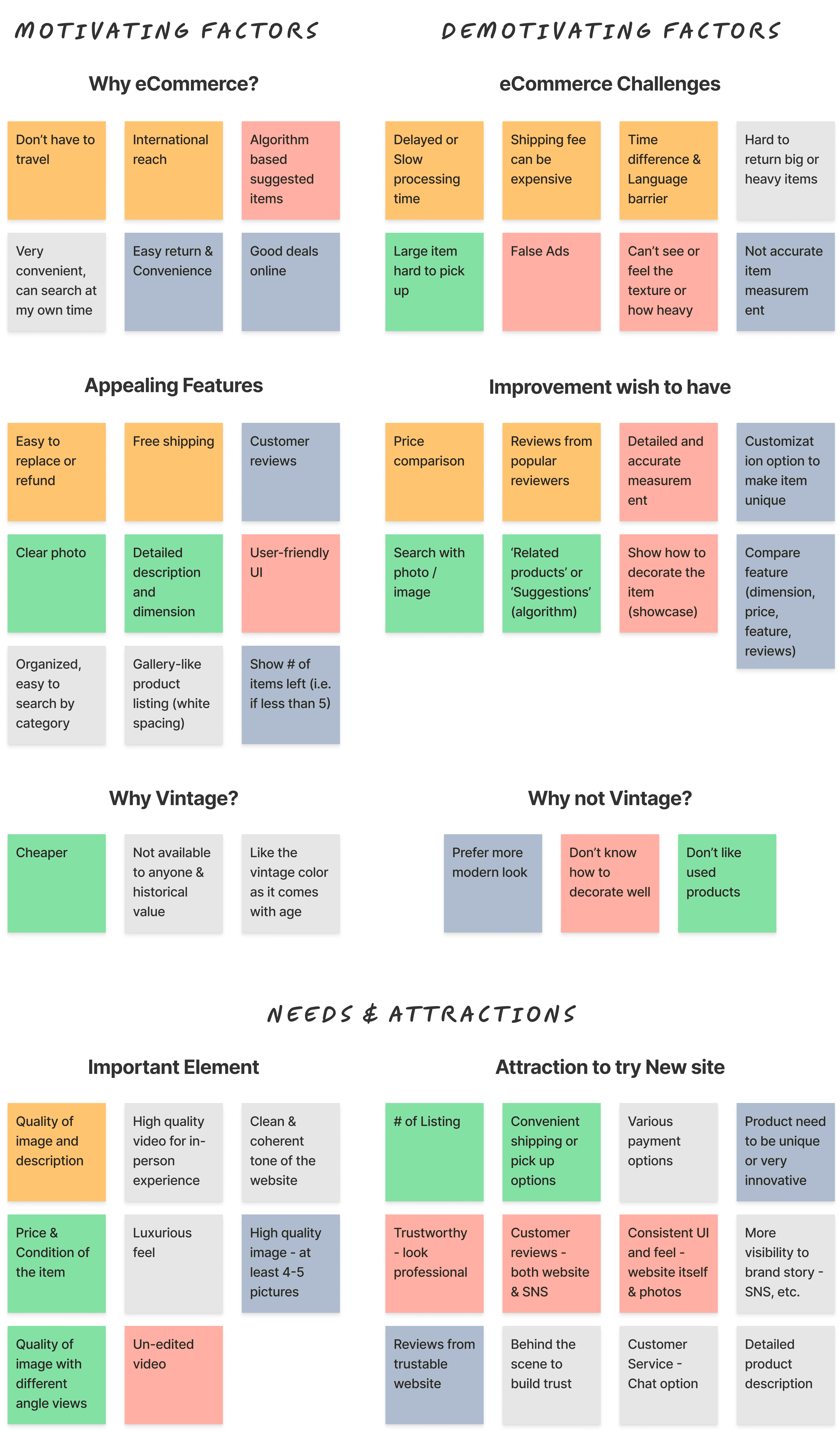
Following the interview, I conducted an Affinity Mapping exercise to categorize the information gathered from users to better organize ideas visually and see similarities in users’ feedback. This process helped me to grasp key insights and deeply understand users' needs.
Following the interview, I conducted an Affinity Mapping exercise to categorize the information gathered from users to better organize ideas visually and see similarities in users’ feedback. This process helped me to grasp key insights and deeply understand users' needs.
Following the interview, I conducted an Affinity Mapping exercise to categorize the information gathered from users to better organize ideas visually and see similarities in users’ feedback. This process helped me to grasp key insights and deeply understand users' needs.
| Interview Findings
| Interview Findings
| Interview Findings


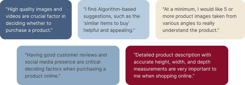
80% of users enjoyed algorithm-based suggestions like 'similar items to buy'
80% of users enjoyed algorithm-based suggestions like 'similar items to buy'
80% of users enjoyed algorithm-based suggestions like 'similar items to buy'
Four out of five users mentioned that algorithm-based suggestions, such as the 'similar items to buy' or 'others bought together' features, are either an appealing aspect of a website or an improvement they wish other websites would offer.
Four out of five users mentioned that algorithm-based suggestions, such as the 'similar items to buy' or 'others bought together' features, are either an appealing aspect of a website or an improvement they wish other websites would offer.
Four out of five users mentioned that algorithm-based suggestions, such as the 'similar items to buy' or 'others bought together' features, are either an appealing aspect of a website or an improvement they wish other websites would offer.
All users found high-quality product images and videos to be crucial
All users found high-quality product images and videos to be crucial
All users found high-quality product images and videos to be crucial
All users stated that having high-quality product images and videos are crucial factors in deciding whether to purchase a product. One user mentioned that a video showing someone holding or using the product would help in better understanding its measurements. Another user noted that videos could offer a virtual in-store experience. Users agreed that providing a minimum of 4 to 6 pictures is ideal for understanding the product.
All users stated that having high-quality product images and videos are crucial factors in deciding whether to purchase a product. One user mentioned that a video showing someone holding or using the product would help in better understanding its measurements. Another user noted that videos could offer a virtual in-store experience. Users agreed that providing a minimum of 4 to 6 pictures is ideal for understanding the product.
All users stated that having high-quality product images and videos are crucial factors in deciding whether to purchase a product. One user mentioned that a video showing someone holding or using the product would help in better understanding its measurements. Another user noted that videos could offer a virtual in-store experience. Users agreed that providing a minimum of 4 to 6 pictures is ideal for understanding the product.




All users stressed the importance of having a detailed product description
All users emphasized the importance of having a detailed product description. A common challenge they faced with online shopping was the lack of accurate or comprehensive product descriptions, especially concerning measurements like height, width, and depth.
All users emphasized the importance of having a detailed product description. A common challenge they faced with online shopping was the lack of accurate or comprehensive product descriptions, especially concerning measurements like height, width, and depth.
All users emphasized the importance of having a detailed product description. A common challenge they faced with online shopping was the lack of accurate or comprehensive product descriptions, especially concerning measurements like height, width, and depth.
80% of users said customer reviews are crucial for purchase decisions
80% of users said customer reviews are crucial for purchase decisions
80% of users said customer reviews are crucial for purchase decisions
Four out of five users noted that customer reviews are a crucial factor in deciding whether to purchase a product. Most users mentioned that having customer reviews on both the website and the brand's social media platforms increases credibility and helps build trust in the brand. Social media often provides behind-the-scenes insights and additional context about the seller, enhancing the reliability of the reviews.
Four out of five users noted that customer reviews are a crucial factor in deciding whether to purchase a product. Most users mentioned that having customer reviews on both the website and the brand's social media platforms increases credibility and helps build trust in the brand. Social media often provides behind-the-scenes insights and additional context about the seller, enhancing the reliability of the reviews.
Four out of five users noted that customer reviews are a crucial factor in deciding whether to purchase a product. Most users mentioned that having customer reviews on both the website and the brand's social media platforms increases credibility and helps build trust in the brand. Social media often provides behind-the-scenes insights and additional context about the seller, enhancing the reliability of the reviews.



DEFINE
DEFINE
DEFINE
| User Persona
| User Persona
| User Persona
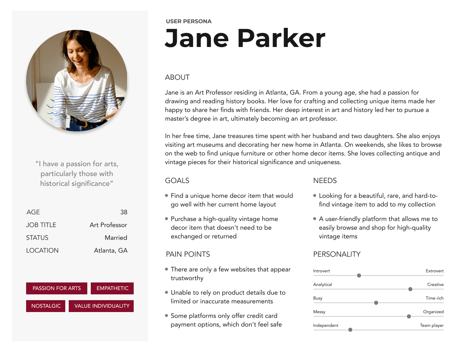
After synthesizing my research, I've created a persona to better define potential users and their needs for purchasing vintage products.
After synthesizing my research, I've created a persona to better define potential users and their needs for purchasing vintage products.
After synthesizing my research, I've created a persona to better define potential users and their needs for purchasing vintage products.


| POV & HMW
| POV & HMW
| POV & HMW
I created “Point Of View” statements and “How Might We” questions to make it clear who we are designing for and what our focus should be to meet users’ needs.
I created “Point Of View” statements and “How Might We” questions to make it clear who we are designing for and what our focus should be to meet users’ needs.
I created “Point Of View” statements and “How Might We” questions to make it clear who we are designing for and what our focus should be to meet users’ needs.
Point of View
Point of View
Point of View
Customers who appreciate vintage items often hesitate to buy them due to uncertainty about incorporating them into home decor.
Adding a showcase section with images demonstrating how to decorate with these pieces could encourage purchases and guide customers, potentially leading to additional sales.
How Might We
How Might We
How Might We
How might we improve customer experience by incorporating ‘suggested items to buy together,' making it easier for customers to find related items for decorating?
How might we design the product image or product list section to demonstrate how to decorate the piece and encourage repeated visits?
How might we improve customer experience by incorporating ‘suggested items to buy together,' making it easier for customers to find related items for decorating?
How might we design the product image or product list section to demonstrate how to decorate the piece and encourage repeated visits?
How might we improve customer experience by incorporating ‘suggested items to buy together,' making it easier for customers to find related items for decorating?
How might we design the product image or product list section to demonstrate how to decorate the piece and encourage repeated visits?
Point of View
Point of View
Point of View
Customers often hesitate to buy from new websites due to insecurity and lack of trust. For emerging brands, this can mean missed revenue and low conversion rates. Establishing brand trust and awareness is crucial for new websites and business owners. This fosters a sense of security among customers, encouraging customers to visit, share information, and make purchases confidently.
Customers often hesitate to buy from new websites due to insecurity and lack of trust. For emerging brands, this can mean missed revenue and low conversion rates. Establishing brand trust and awareness is crucial for new websites and business owners. This fosters a sense of security among customers, encouraging customers to visit, share information, and make purchases confidently.
Customers often hesitate to buy from new websites due to insecurity and lack of trust. For emerging brands, this can mean missed revenue and low conversion rates. Establishing brand trust and awareness is crucial for new websites and business owners. This fosters a sense of security among customers, encouraging customers to visit, share information, and make purchases confidently.
How Might We
How Might We
How Might We
How might we ensure users feel secure when visiting, browsing, and shopping on the new website?
How might we ensure users feel secure when visiting, browsing, and shopping on the new website?
How might we ensure users feel secure when visiting, browsing, and shopping on the new website?
IDEATE
IDEATE
IDEATE
| User Flow
| User Flow
| User Flow
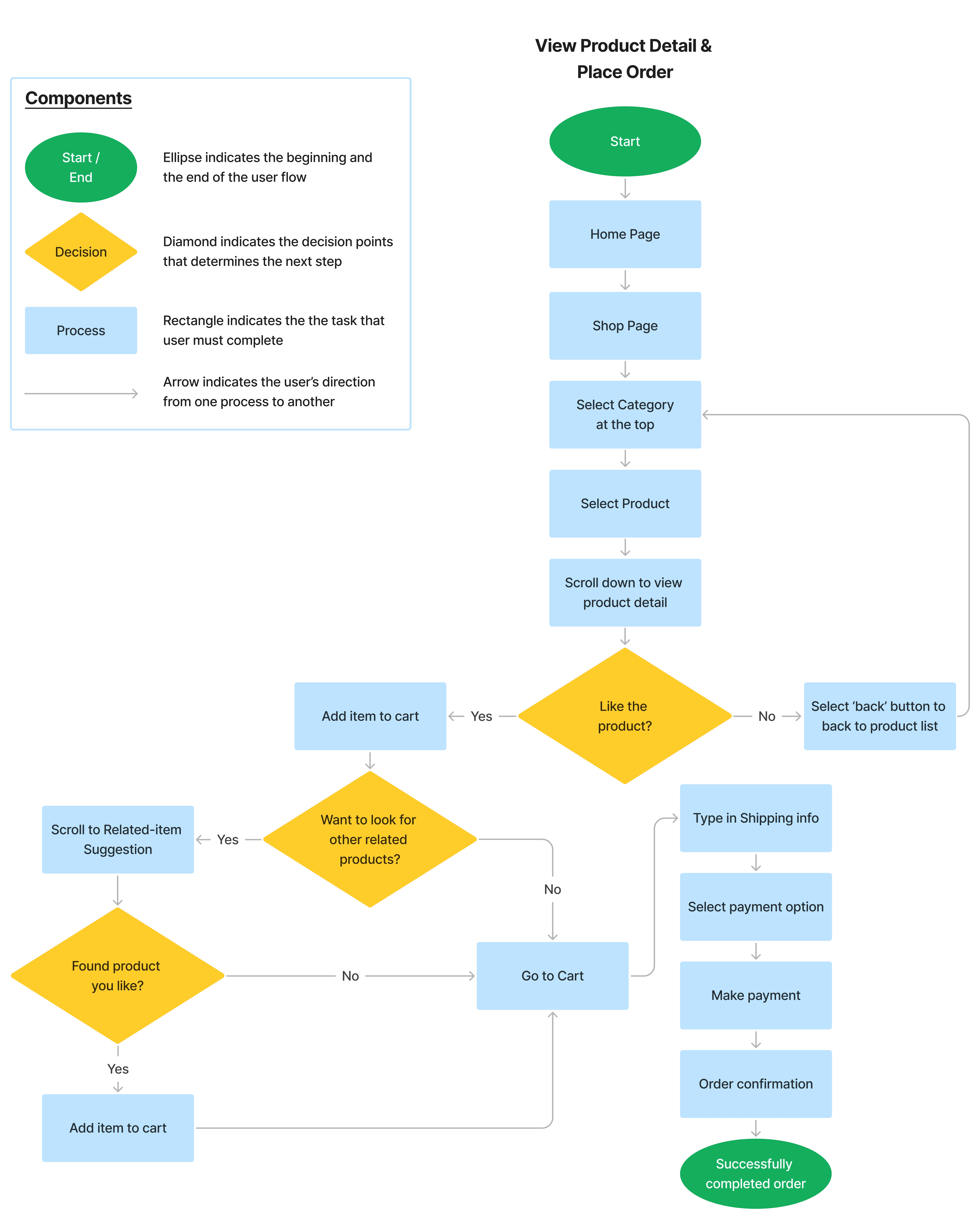
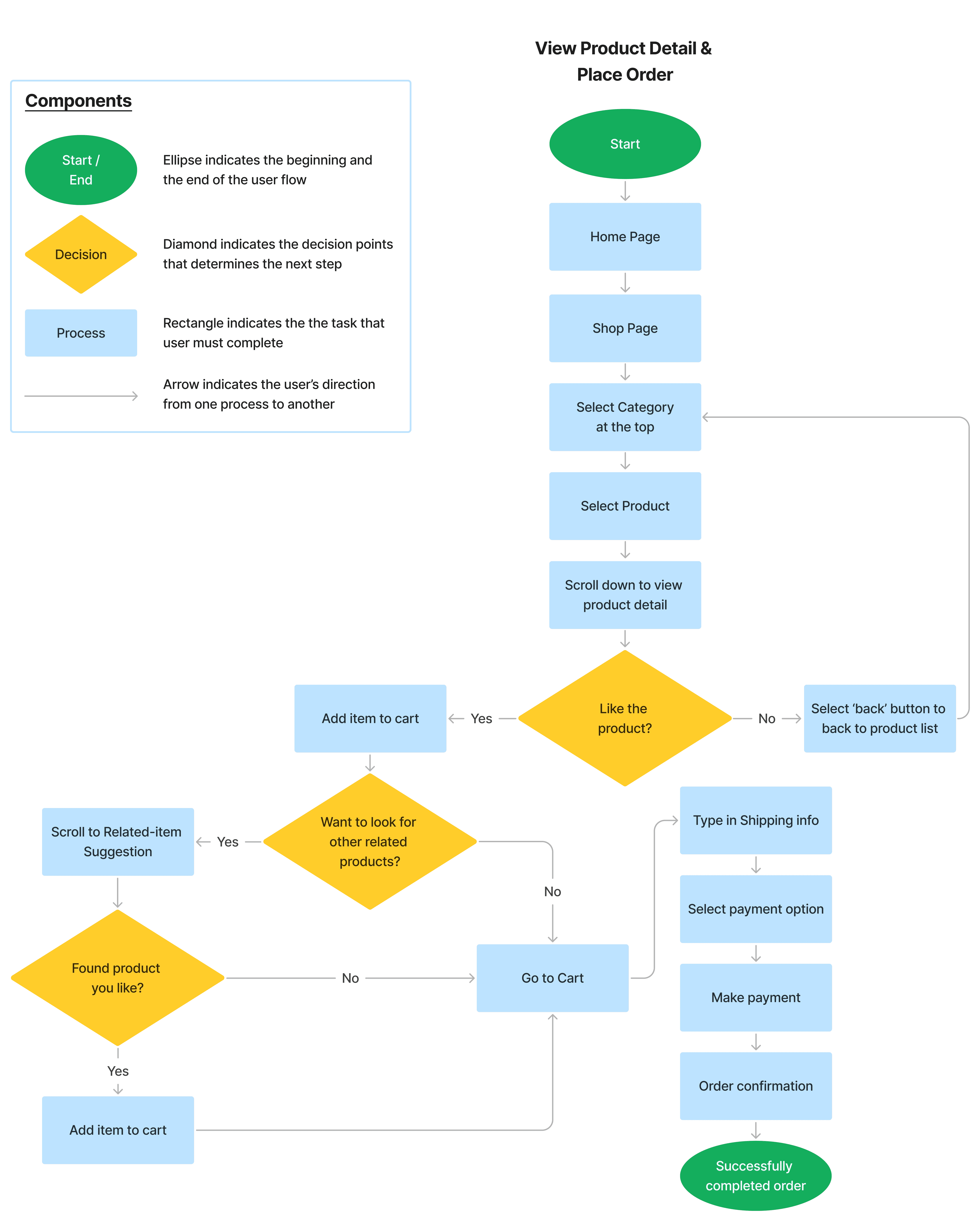
A user flow was created to map the journey through the website, detailing how users navigate to complete tasks and what actions are needed for a smooth, successful experience.
A user flow was created to map the journey through the website, detailing how users navigate to complete tasks and what actions are needed for a smooth, successful experience.
A user flow was created to map the journey through the website, detailing how users navigate to complete tasks and what actions are needed for a smooth, successful experience.

DESIGN
DESIGN
DESIGN
| Low-Fidelity Wireframe
| Low-Fidelity Wireframe
| Low-Fidelity Wireframe
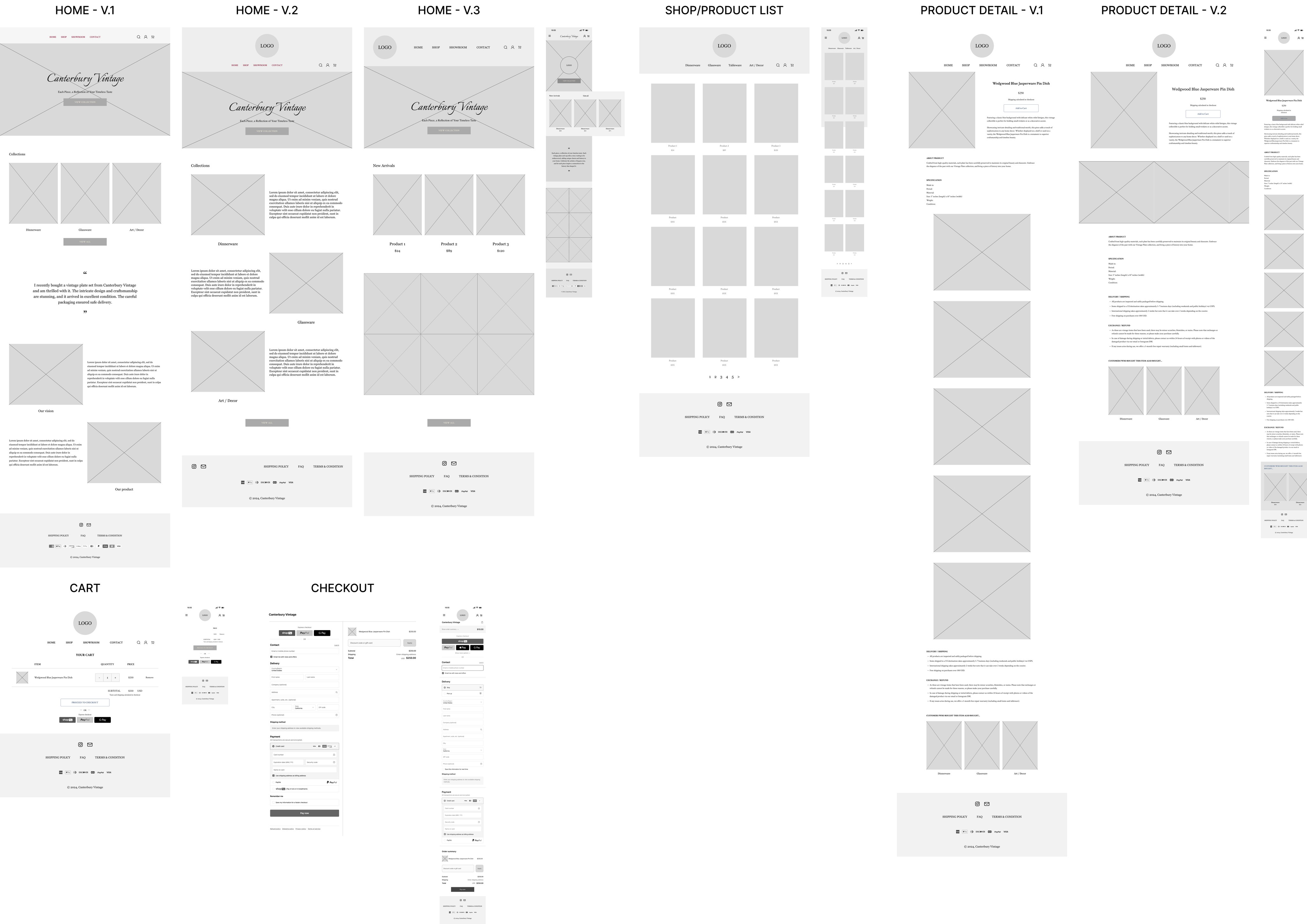
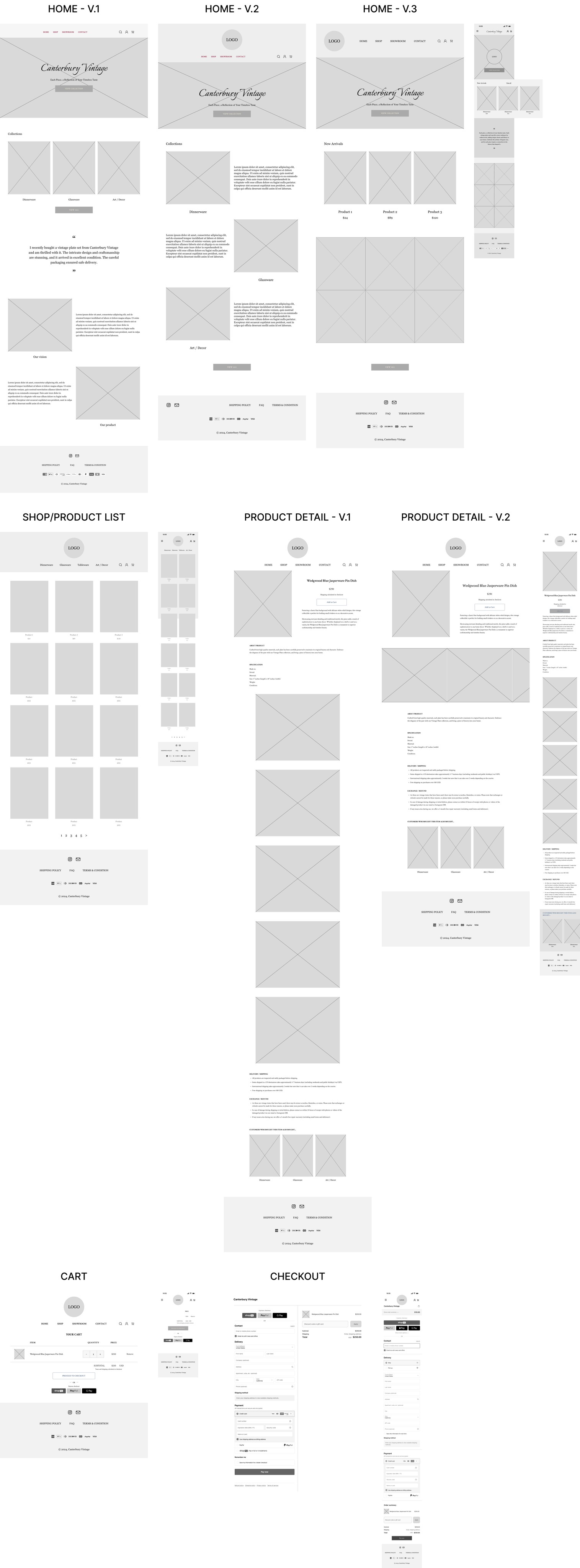
I sketched out lower-fidelity wireframes for five key screens: home, shop, product detail, cart, and checkout. For the home and product detail screens, I provided several layout and style variations for my client to review and choose from before proceeding to high-fidelity designs.
I sketched out lower-fidelity wireframes for five key screens: home, shop, product detail, cart, and checkout. For the home and product detail screens, I provided several layout and style variations for my client to review and choose from before proceeding to high-fidelity designs.
I sketched out lower-fidelity wireframes for five key screens: home, shop, product detail, cart, and checkout. For the home and product detail screens, I provided several layout and style variations for my client to review and choose from before proceeding to high-fidelity designs.

| Branding
| Branding
| Branding
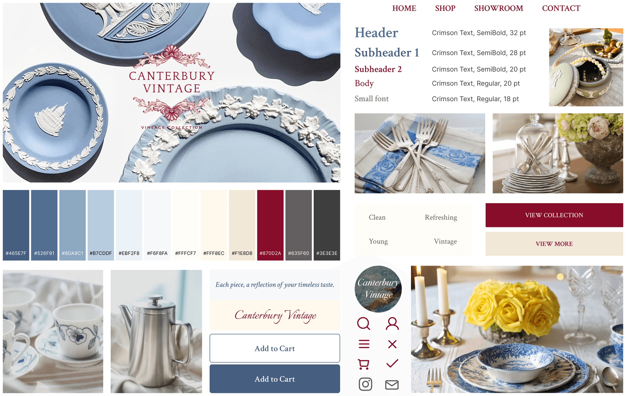
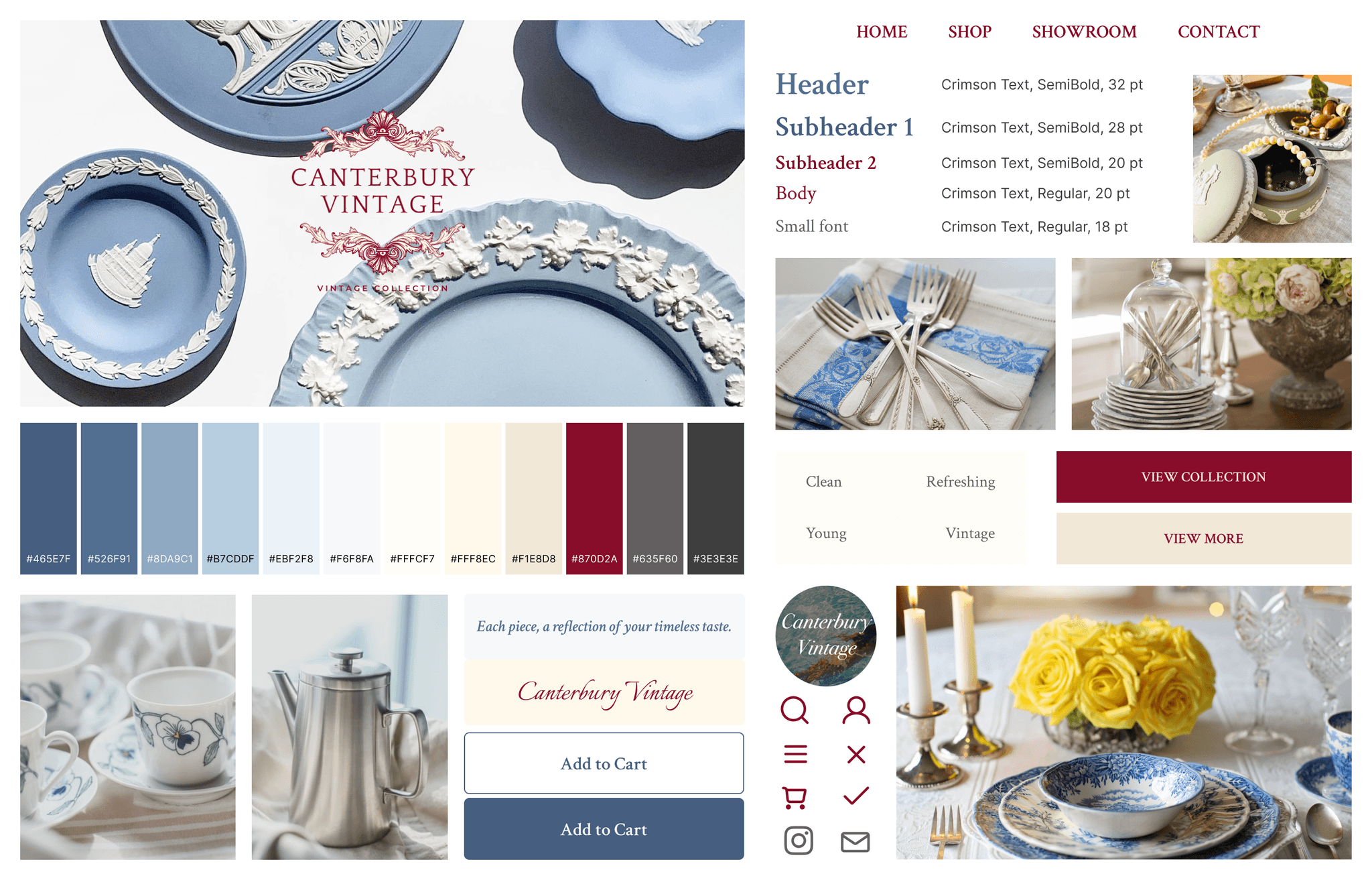
The client provided photos for brand color references and desired a clean, elegant, and refreshing look. The style tile was developed based on these references and client feedback.
The client provided photos for brand color references and desired a clean, elegant, and refreshing look. The style tile was developed based on these references and client feedback.
The client provided photos for brand color references and desired a clean, elegant, and refreshing look. The style tile was developed based on these references and client feedback.

| High Fidelity Wireframe
| High Fidelity Wireframe
| High Fidelity Wireframe
Utilizing the style guide/branding, I designed high-fidelity wireframes to see how the website looked and to evaluate visual effectiveness and hierarchy.
Utilizing the style guide/branding, I designed high-fidelity wireframes to see how the website looked and to evaluate visual effectiveness and hierarchy.
Utilizing the style guide/branding, I designed high-fidelity wireframes to see how the website looked and to evaluate visual effectiveness and hierarchy.


TEST
TEST
TEST
| Usability Testing
| Usability Testing
| Usability Testing
Usability testing was conducted to identify missing gaps, problems, or inconsistencies as users navigate through the Canterbury Vintage website. Five users were recruited to test the usability, and they were asked to complete 3 tasks:
After browsing the product lists, add a product to the shopping cart
Find another related product to decorate with
Place orders on both items in the cart
Overall, users found the platform easy to use and the design aesthetically pleasing, professional, and simple. By observing their interactions, I validated what worked well, identified potential challenges, and pinpointed high-priority areas for improvement. Below are the findings for each, along with the success metrics used to evaluate the platform's usability.
Success metrics
Success metrics
Success metrics
The time it took for users to complete each task
Number of errors while completing each task
The successful completion rate for each task (among users)
User feedback and satisfaction (i.e. easiness on a scale between 1 - 10)
The time it took for users to complete each task
Number of errors while completing each task
The successful completion rate for each task (among users)
User feedback and satisfaction (i.e. easiness on a scale between 1 - 10)
The time it took for users to complete each task
Number of errors while completing each task
The successful completion rate for each task (among users)
User feedback and satisfaction (i.e. easiness on a scale between 1 - 10)
What worked well
What worked well
What worked well
Easy to use: All users expressed that the platform looked straightforward to use (on a scale of 1 - 10, 10 being easiest to use, the average rating was 10)
Color scheme: Users liked the color scheme used, logo design, and antique yet modern design
Image size and placement: Users liked the image size of the product picture - they expressed the pictures were big enough to see the product clearly and in detail
User-friendly and effective UI: Users were able to complete each task within a few seconds (average 2-3 seconds, longest ~8 seconds)
Intuitive platform setup: Users were able to complete each task with no or minimal error
Challenges
Challenges
Challenges
Confusing Wording: Two participants were unsure of the difference between 'View Collection' and 'Shop.' They expected 'View Collection' to link to a showroom or gallery and 'Shop' to lead to the product listing page, but both directed to the same product listing.
Clear Division: Two participants suggested making the ‘Customers who bought this item also bought’ section stand out more, either by changing the font color or adding a divider.
Shipping & Refund Placement: Two participants suggested moving 'delivery/shipping' and 'exchange/refund' details to a separate page, finding them repetitive on product pages. However, the client prefers the current design to minimize refund/exchange claims, crucial for the business's sustainability.
Placement of Related Products: One participant suggested moving the 'Customers Who Bought This Item Also Bought' section to the 'Item added to cart' pop-up, making it more accessible and reducing scrolling.
Breadcrumb Navigation: One participant suggested adding breadcrumb navigation (e.g., ‘shop > dinnerware’) at the top of the product detail page to help users trace their path and understand the website hierarchy.
Logo: The client wants to slightly increase the size of the logo in the hero section.
Ideas - High & Medium priority
Ideas - High & Medium priority
Ideas - High & Medium priority
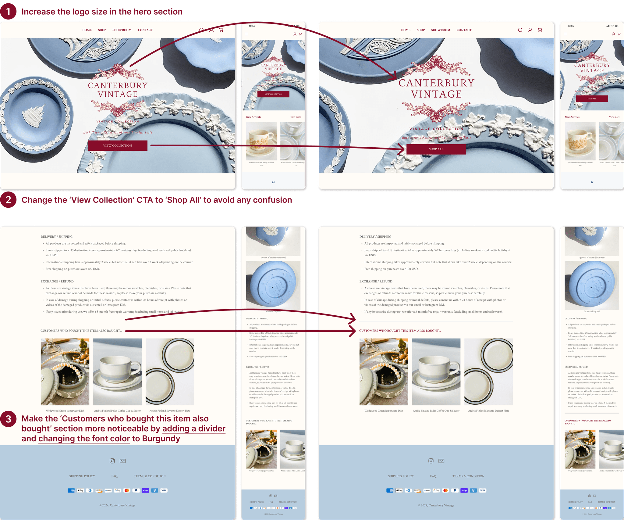
Change the ‘View Collection’ CTA to ‘Shop All’ to avoid any confusion - High priority (severity)
Make the ‘Customers who bought this item also bought’ section more noticeable by adding a divider and changing the font color to Burgundy - High priority (frequency)
Increase the logo size in the hero section - High priority (severity - client request)
ITERATE
ITERATE
ITERATE
| Revisions
| Revisions
| Revisions
Based on usability testing feedback, I addressed the high-priority items. I increased the logo size in the hero section per the client's request. To reduce CTA button confusion, I changed 'View Collection' to 'Shop All.' Additionally, I made the 'Customers Who Bought This Item Also Bought' section more noticeable by adding a divider and changing the font color to burgundy.
Based on usability testing feedback, I addressed the high-priority items. I increased the logo size in the hero section per the client's request. To reduce CTA button confusion, I changed 'View Collection' to 'Shop All.' Additionally, I made the 'Customers Who Bought This Item Also Bought' section more noticeable by adding a divider and changing the font color to burgundy.
Based on usability testing feedback, I addressed the high-priority items. I increased the logo size in the hero section per the client's request. To reduce CTA button confusion, I changed 'View Collection' to 'Shop All.' Additionally, I made the 'Customers Who Bought This Item Also Bought' section more noticeable by adding a divider and changing the font color to burgundy.


| Final Prototype
| Final Prototype
| Final Prototype
Introducing Canterbury Vintage's
First-Ever Responsive Web Design
Introducing Canterbury Vintage's
First-Ever Responsive Web Design
Introducing Canterbury Vintage's
First-Ever Responsive Web Design
★ Users can explore the home page to discover the company’s new arrivals, vision, products, and social media contacts
★ Users can explore the home page to discover the company’s new arrivals, vision, products, and social media contacts
★ Users can explore the home page to discover the company’s new arrivals, vision, products, and social media contacts
★ Users can find a specific product from the product list, review the details, and add the item to the cart
★ Users can find a specific product from the product list, review the details, and add the item to the cart
★ Users can find a specific product from the product list, review the details, and add the item to the cart
★ Users can discover related products and add them to the cart too
★ Users can discover related products and add them to the cart too
★ Users can discover related products and add them to the cart too
★ After adding items to the cart, users can proceed to checkout using various payment methods
★ After adding items to the cart, users can proceed to checkout using various payment methods
★ After adding items to the cart, users can proceed to checkout using various payment methods
| Takeaways
| Takeaways
| Takeaways
This project significantly contributed to my growth as a UX designer by allowing me to work with a real client on creating a website for her vintage products business, boosting my confidence through her satisfaction and appreciation. I enjoyed diving into her needs and design preferences, especially when it came to the logo design.
During user research, I found that many participants weren’t familiar with vintage items, so I adjusted my focus to their e-commerce experiences instead. To ensure my designs met user needs and goals, I used problem statements, user personas, and maintained regular communication with the client, verifying everything through usability testing.
The most significant lesson from this project was the importance of clear and regular communication with the client. I discovered the value of frequent discussions and feedback throughout the project. Early on, I had an extensive conversation with my client about her primary goals, preferred styles, and color preferences for her brand. These insights proved invaluable, helping me better understand her vision and reduce the need for revisions as the project progressed. The client expressed great satisfaction with both the logo designs and initial wireframes, confirming that my designs were on the right track. In future projects, I plan to continue scheduling regular meetings with clients and stakeholders to enhance planning and ensure an efficient design process.
© 2024 Christina Kim
© 2024 Christina Kim
